Ad Unit Layouts: Directory Listings
Learn how to structure your ad units on a directory-style listing page.
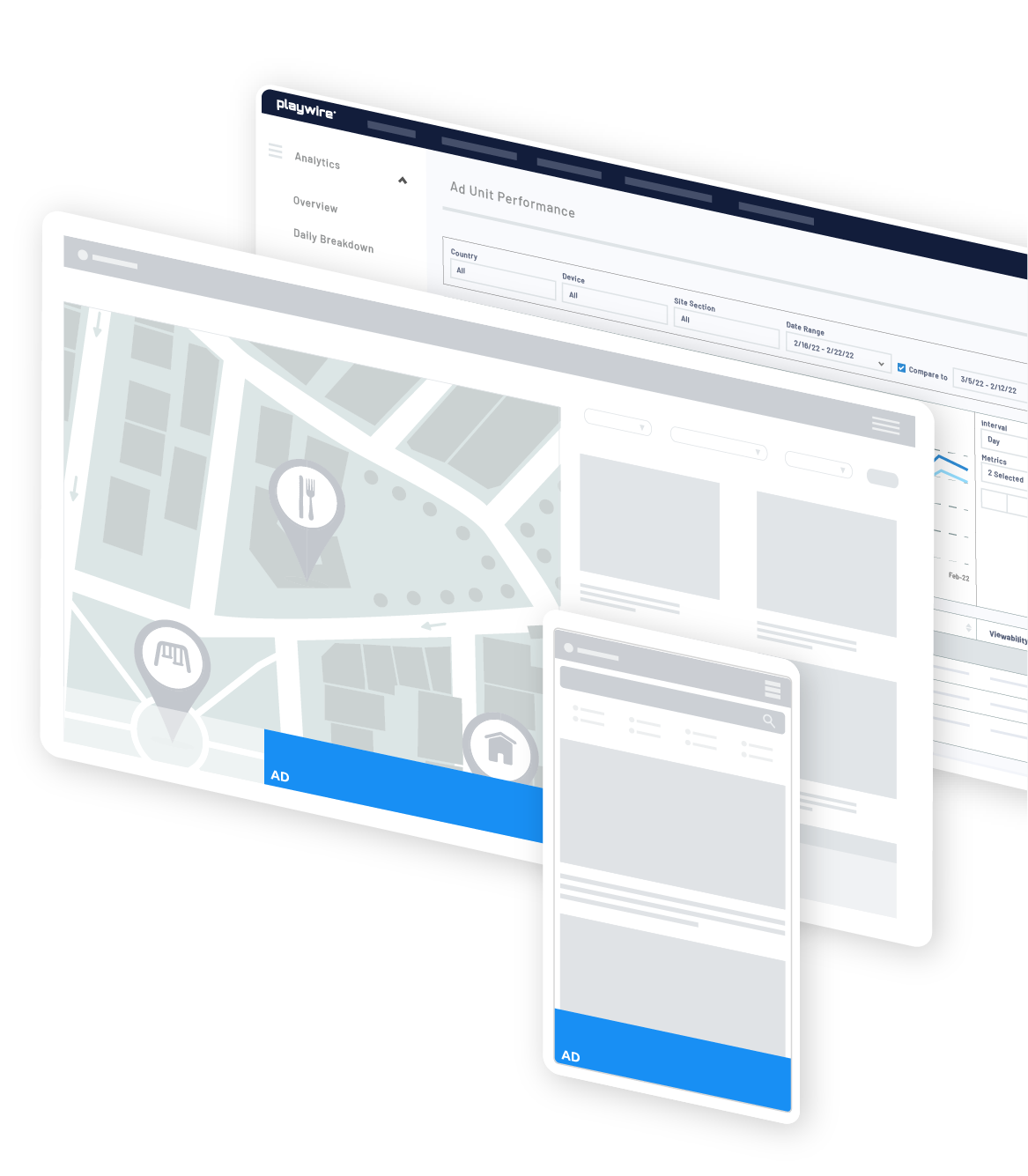
Anatomy of a
Directory Listing
This specific type of listing page is common on directory sites, review sites, and geographic-search related sites. Some layouts include:
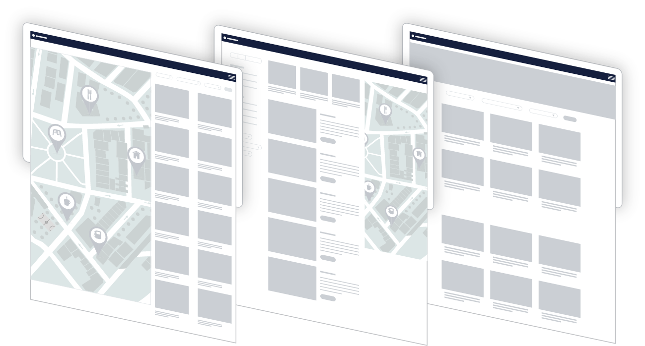
- A map coupled with listings
- Listings with custom filter options
- A combination of a map, listings, and filters
Because there is often a lot of items on the screen that require interactivity on these kinds of pages, you want to introduce ads carefully to preserve the user experience.
Suggested
Layouts
The suggestions below are broken down by conservative, moderate, and aggressive labels. These labels refer to your level of comfort with ad density. In general, the more aggressive you are willing to go, the higher your total ad revenue will be.
Conservative
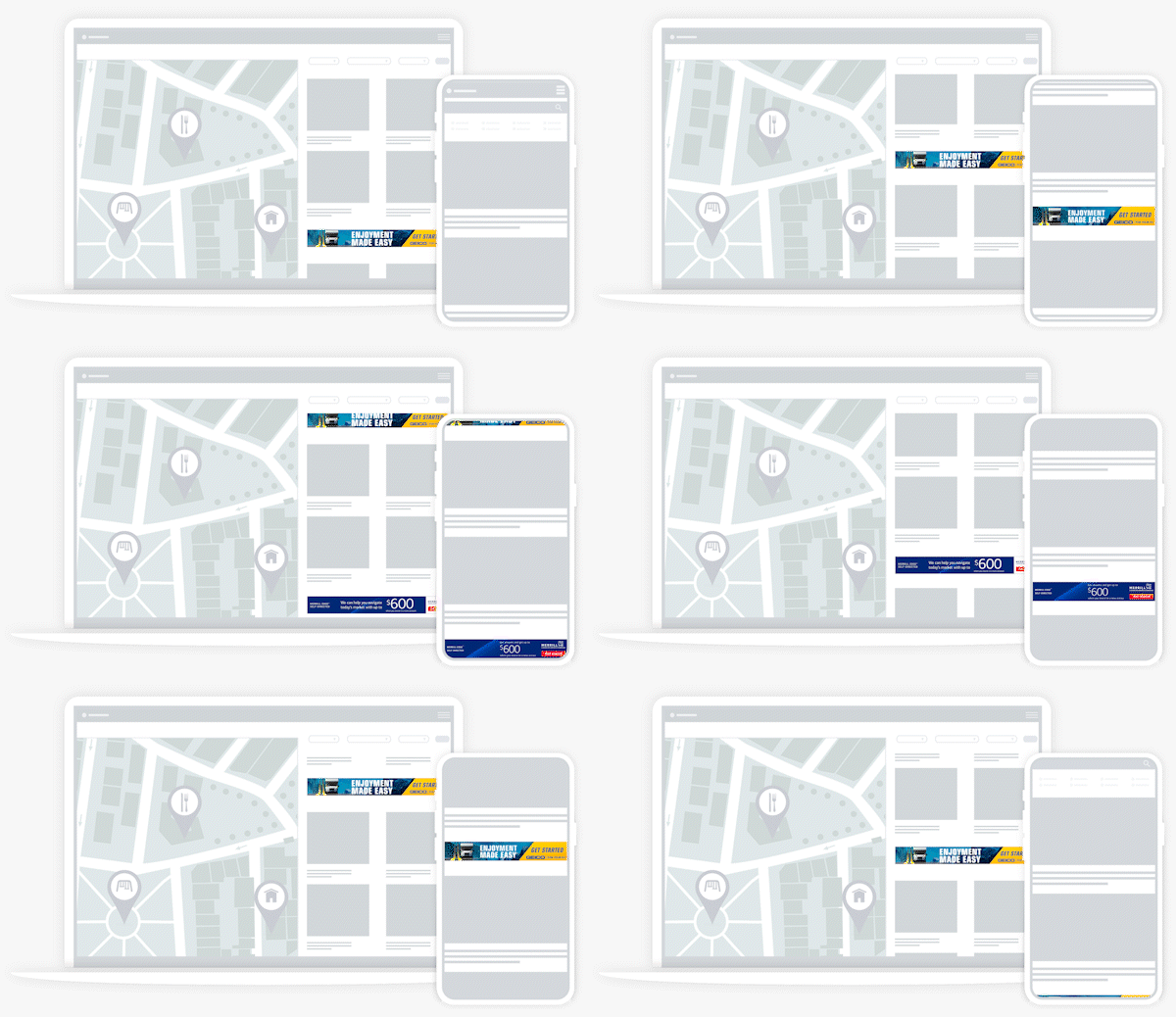
If you'd like to stay on the conservative side with your ad layout, we recommend these following high impact units:
- In Article: Repeat every 2-3 rows if using tiled listings or every 3-5 if listings are show in a single column.
- Optional: Flex Leaderboard (only serves when there is a campaign, overrides all other sticky units when it serves)
Moderate
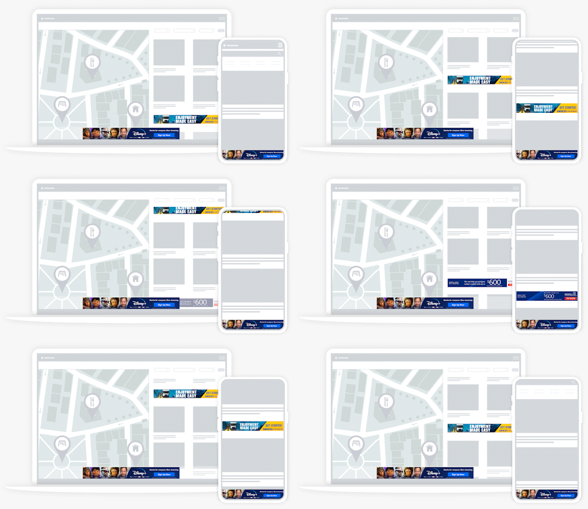
If you're interested in testing the waters and adding a few more units to the mix, these units are great to layer on top of the conservative suggestions:
- Bottom Rail or Mobile Leaderboard, depending on the layout of the page
- Optional: Flex Skin (only serves when there is a campaign, overrides all other sticky units when it serves)
Aggressive
If you're comfortable increasing the ad density a bit more, these additional units can be added to the moderate recommendations without overwhelming the experience:
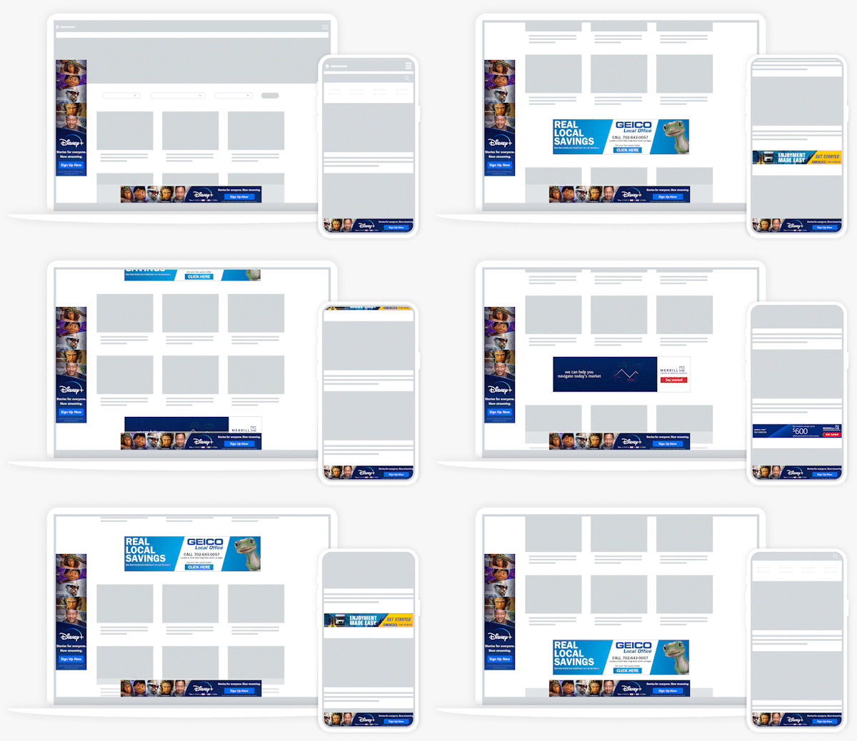
Explore Recommended
Ad Experiences
Explore Options Using the Arrows Below
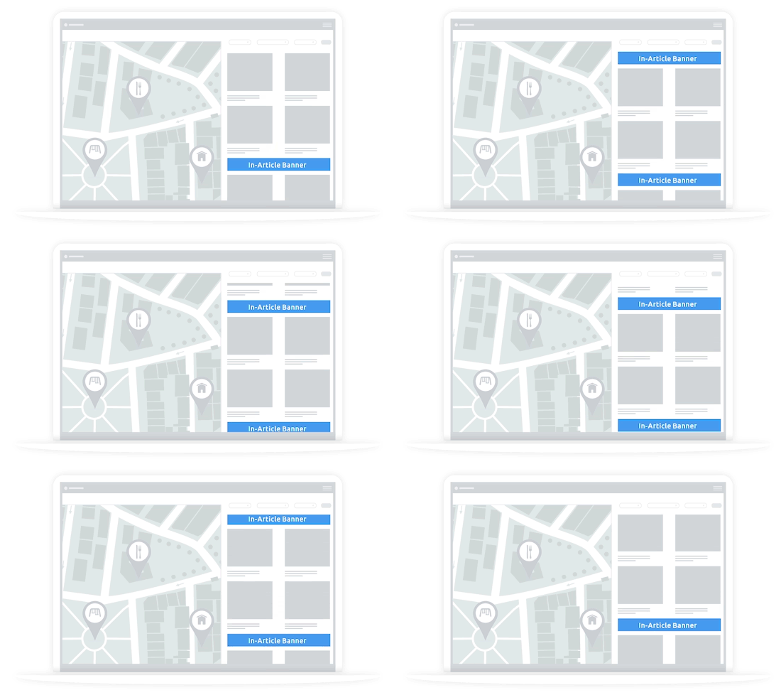
1. Start with In-Article
Start simple by introducing ads between listings on the listings portion of the page. We recommend repeating every 2-3 rows if using tiled listings or every 3-5 if listings are show in a single column.
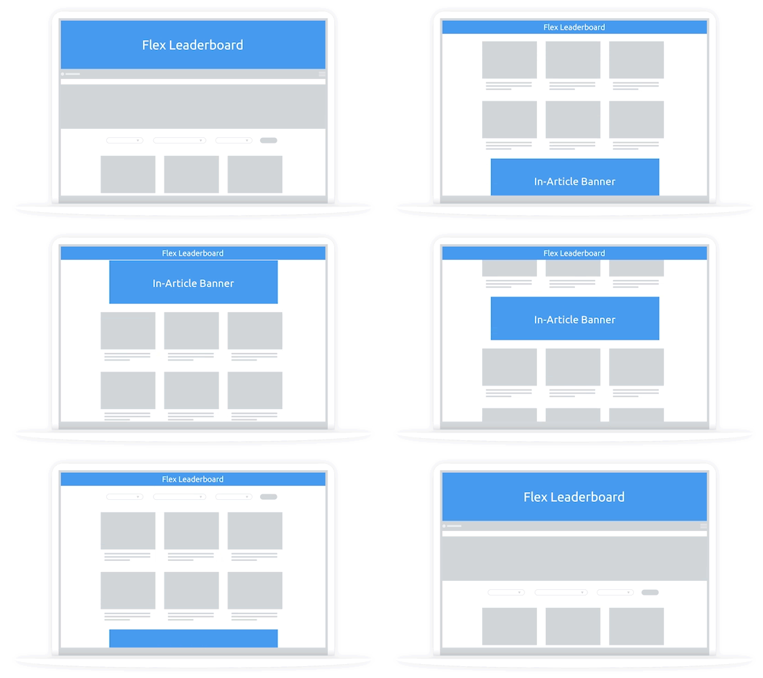
2. Consider Flex Leaderboard
Layer in our Flex Leaderboard unit. It is a great way to access direct demand and increase CPMs without cluttering the user experience.
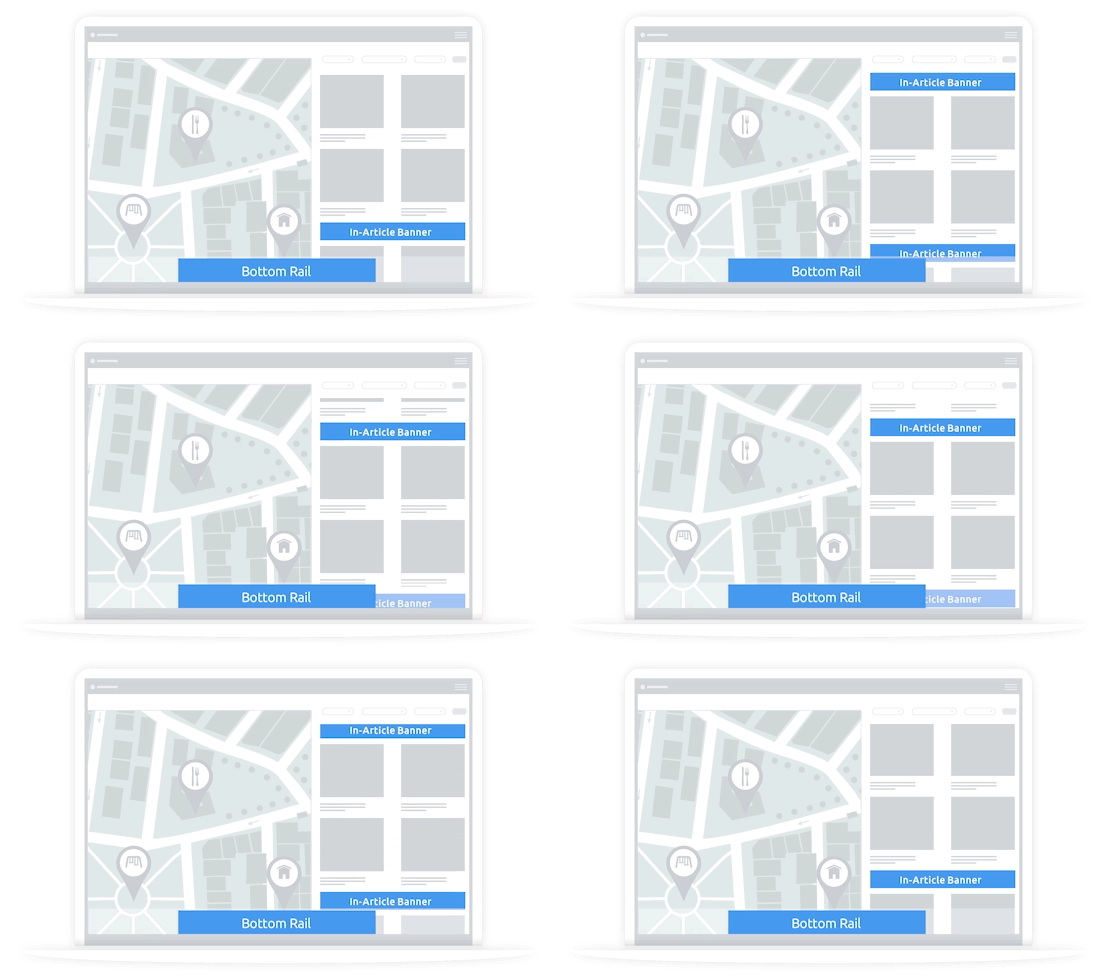
3. Consider a Bottom Rail
Depending on your layout, you may want to test a bottom rail. Just be careful that it doesn't interfere with the filters, map, or other interactive elements on your page.
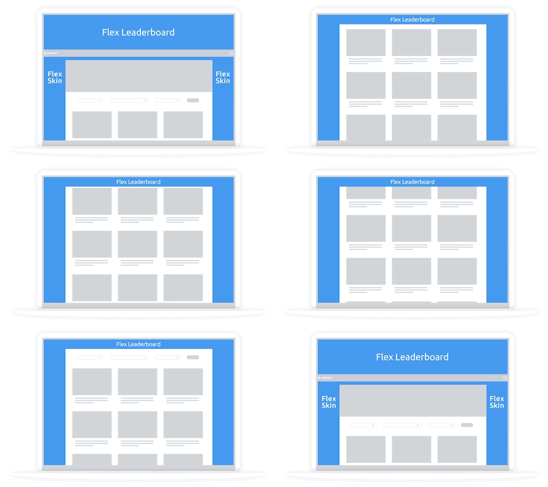
4. Consider a Flex Skin
The Flex Skin unit is a great addition, and it only serves when there is premium, direct demand to fill it. The unit will automatically override all other sticky units on page, keeping your ad experience uncluttered.
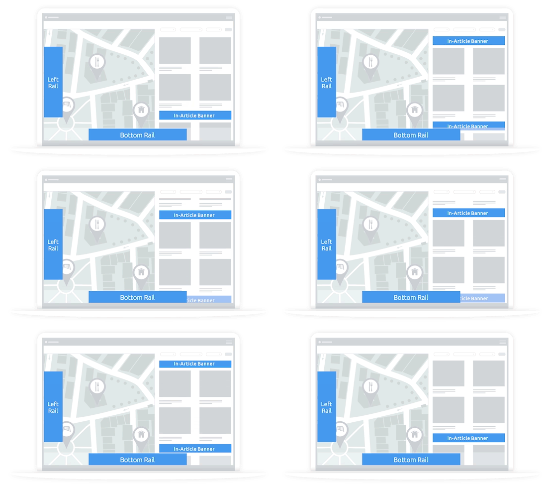
5. Try Out a Left Rail
Typically the left side of the screen is pretty open real-estate, so a sticky side rail is a great option to make the most of that space for a highly viewable unit.
Explore Options Using the Arrows Below
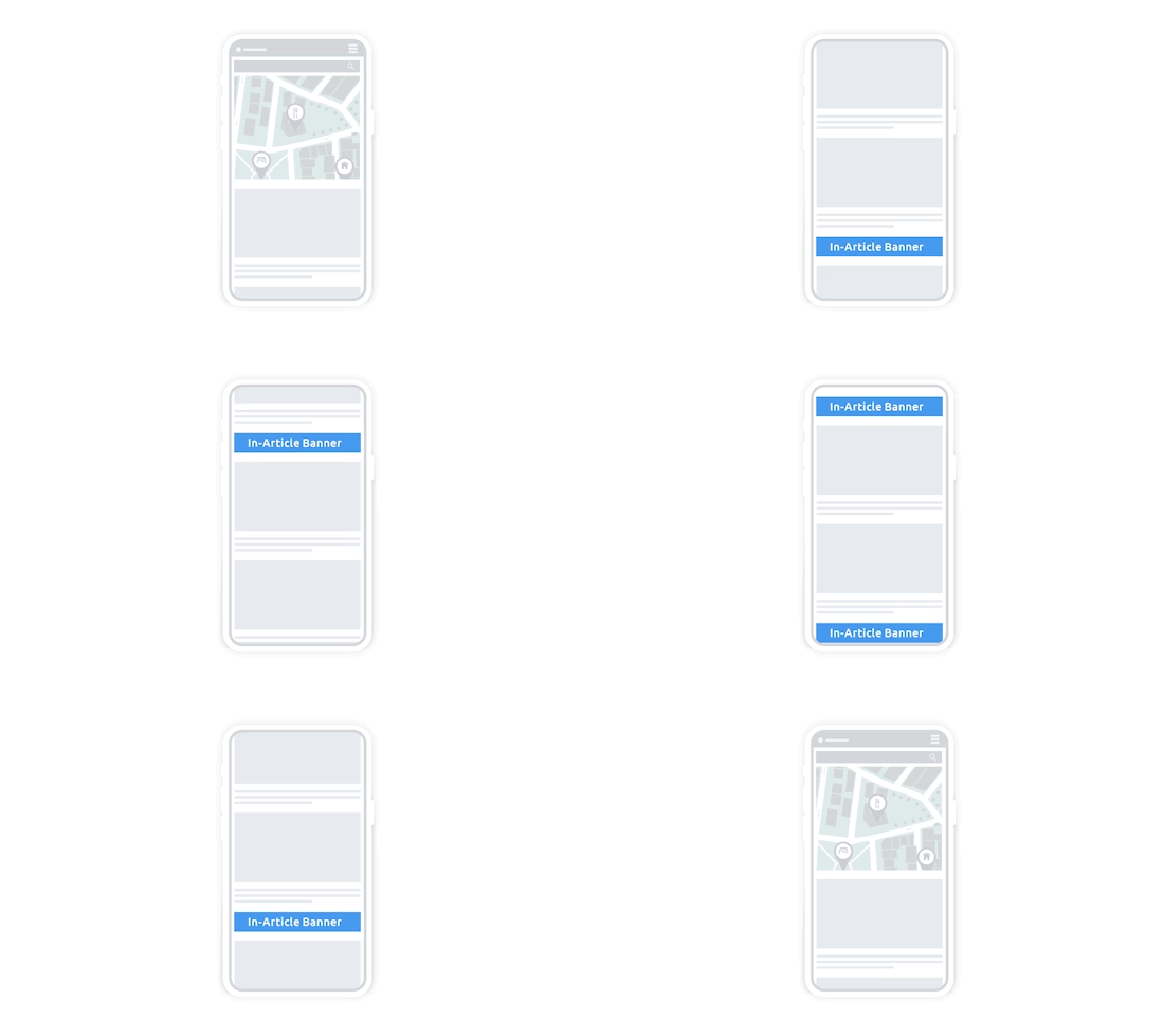
1. Start with an In-Article
Start by adding an in-article unit to help drive incremental revenue without overly changing the user experience.
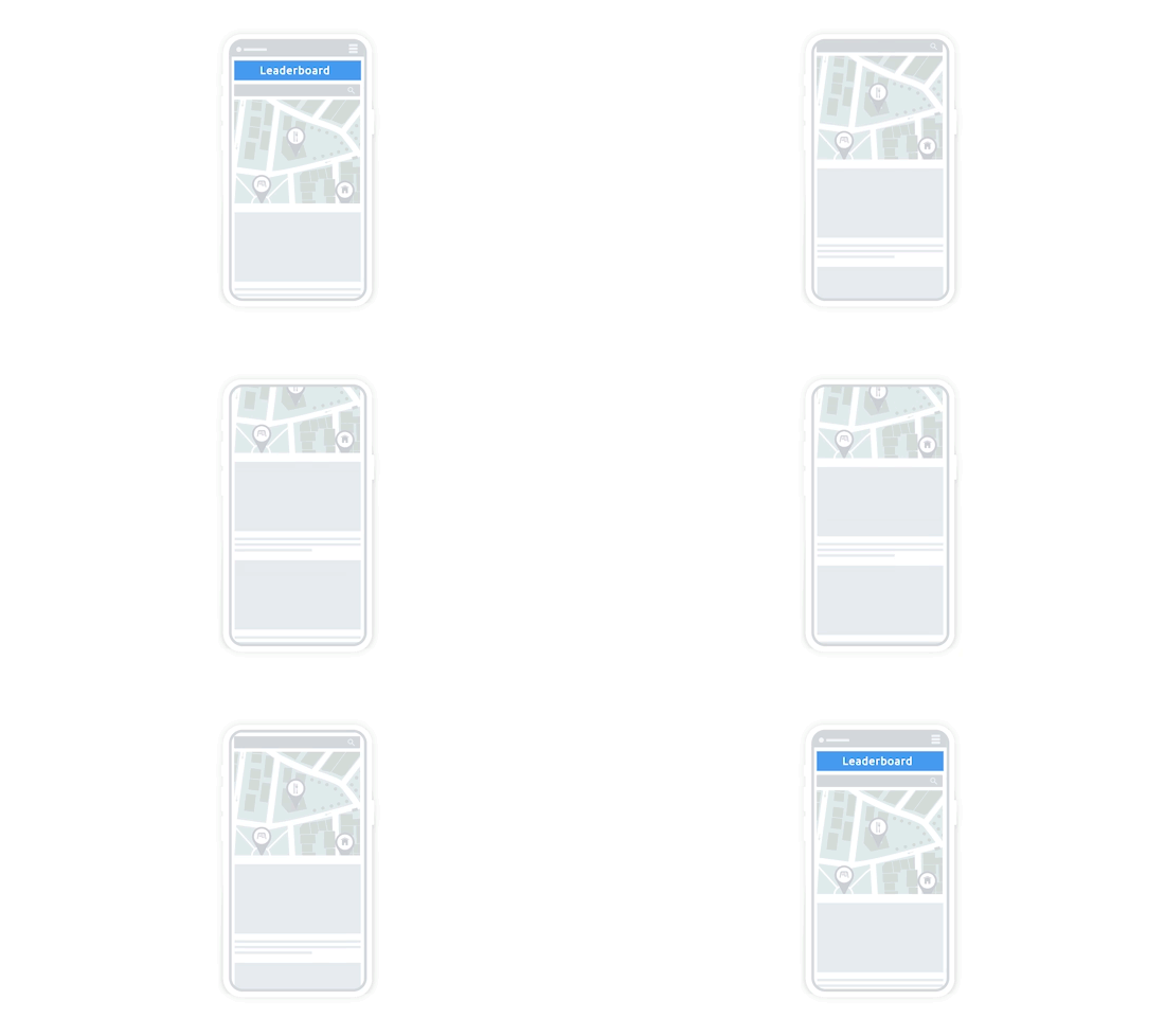
2. Try a Flex Leaderboard
Layer in our Flex Leaderboard unit. This unit will override the Bottom Rail when it serves to keep screen real estate from being overly dense. It is a great way to access direct demand and increase CPMs.

3. Add a Mobile Leaderboard
Depending on the layout of your listing page on mobile, often a leaderboard at the top of the screen, above something like a map, can be a good option.
.gif)
4. Consider a Bottom Rail
Depending on your layout, you may want to test a bottom rail. Just be careful that it doesn't interfere with the filters, map, or other interactive elements on your page.
Additional
Ad Unit Ideas
WEB INTERSTITIAL
Looking to monetize transitions? You can use a web interstitial between screens, when a user selects an item from your listing page.
REWARDED VIDEO
Have premium content? You can use a rewarded video ad to offer access to gated content or to give users an optional ad-free experience on the rest of your site.
Amplify
Your Ad Revenue
Accelerate your business and uncomplicate your ad tech stack, because you deserve a partner and a platform that demands more for you.