Ad Unit Layouts: Listing Pages
Learn how to structure your ad units on a listing page.
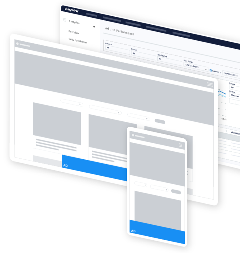
Anatomy of a
Listing Page
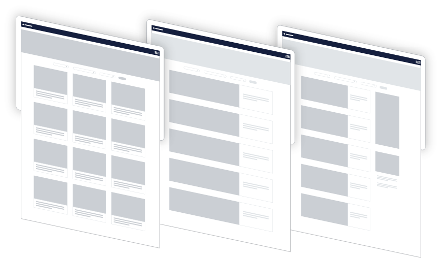
There are three common layouts chosen for listing pages:
- Tiled listings
- Single-column listings
- Single-column listings with a sidebar
The recommendations below apply to all layouts, with some specific callouts for sidebar layouts.
Suggested
Layouts
The suggestions below are broken down by conservative, moderate, and aggressive labels. These labels refer to your level of comfort with ad density. Keep in mind that the right balance is different for each site. In general, as you get more aggressive with your total ad units you'll want to closely watch viewability metrics and ensure you aren't sacrificing viewability for volume.
Conservative
If you'd like to stay on the conservative side with your ad layout, we recommend these following high impact units:
- Bottom Rail
- In Article: Repeat every 2-3 rows on a tiled listing or every 2-3 listings on a single-column listing
- Optional: Flex Leaderboard (only serves when there is a campaign, overrides all other sticky units when it serves)
Moderate
If you're interested in testing the waters and adding a few more units to the mix, these units are great to layer on top of the conservative suggestions:
- Desktop Leaderboard and Mobile Leaderboard
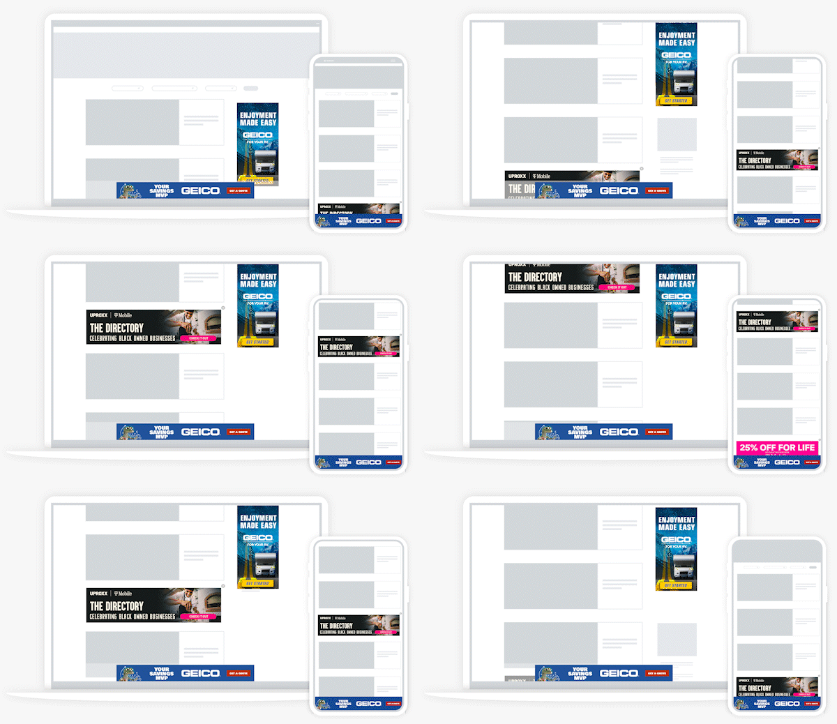
- Use a sticky Medium rectangle (if you have a sidebar)
- Optional: Flex Skin (only serves when there is a campaign, overrides all other sticky units when it serves)
Aggressive
If you're comfortable increasing the ad density a bit more, these additional units can be added to the moderate recommendations without overwhelming the experience:
- Sticky side rail
- Trendi video corner unit
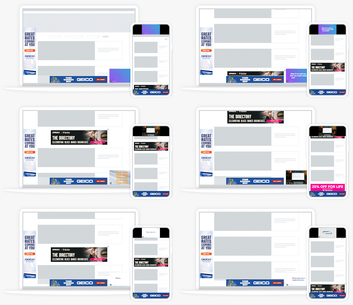
Explore Recommended
Ad Experiences
Explore Options Using the Arrows Below
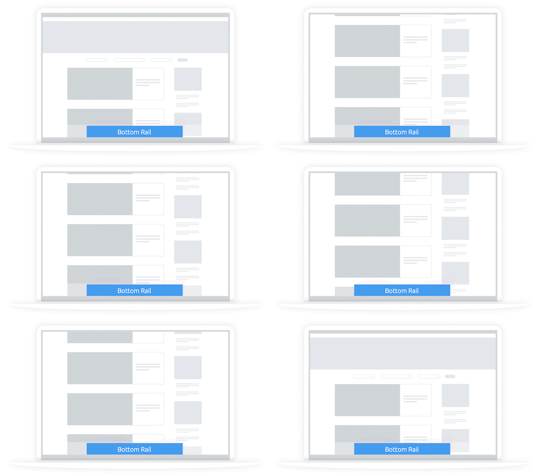
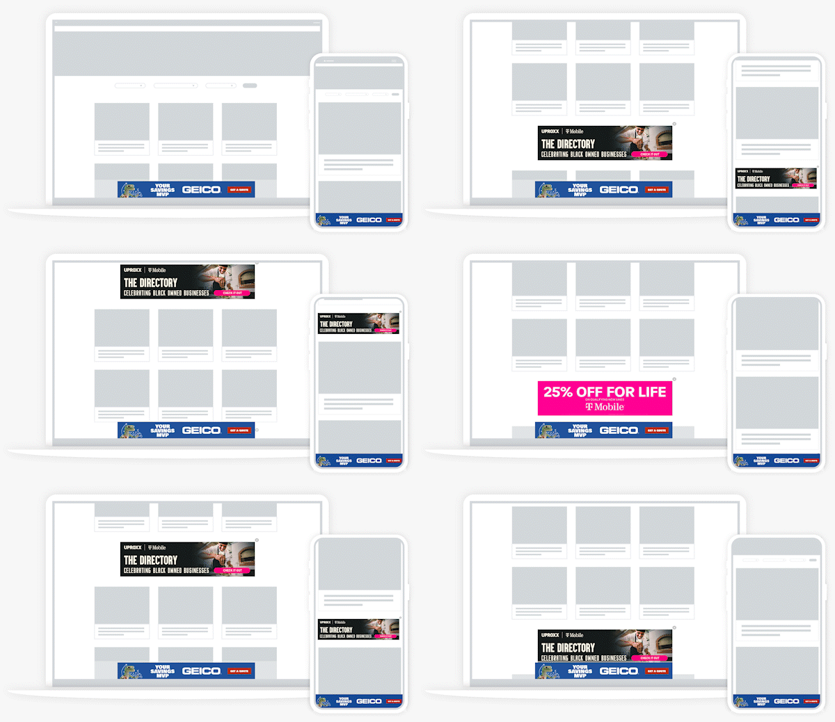
1. Start with a Bottom Rail
Start simple with our most commonly recommended ad unit, a bottom rail, great for viewability and revenue without disrupting experience.
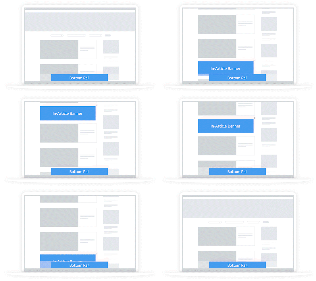
2. Add an In-Article
Add an in-article unit to help drive incremental revenue without overly changing the user experience.
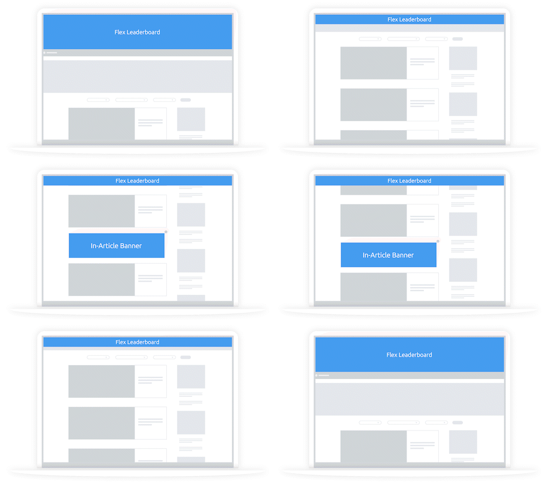
3. Consider Flex Leaderboard
Layer in our Flex Leaderboard unit. This unit will override the Bottom Rail when it serves to keep screen real estate from being overly dense. It is a great way to access direct demand and increase CPMs.
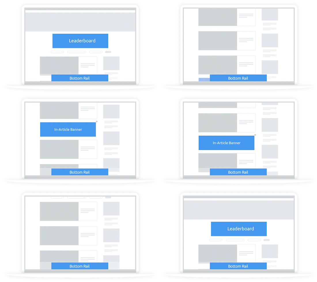
4. Add a Standard Leaderboard
May publishers add in a leaderboard at the top of the screen, a common placement for desktop ads that users aren't bothered by. Be careful not to place it too high that a user scrolls past it before it is in view for more than 1 second.
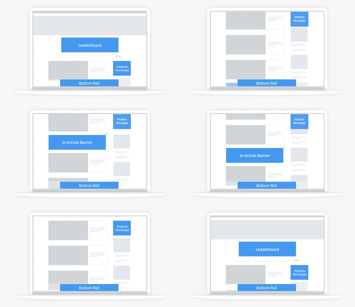
5. Utilize a Medium Rectangle
If you have a sidebar, it is a great opportunity to include a medium rectangle (and make sure to make it sticky), another of our highly profitable units.
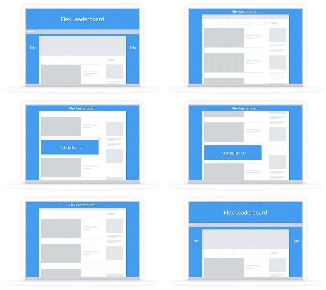
6. Consider a Flex Skin
The Flex Skin unit is a great addition, and it only serves when there is premium, direct demand to fill it. The unit will automatically override all other sticky units on page, keeping your ad experience uncluttered.
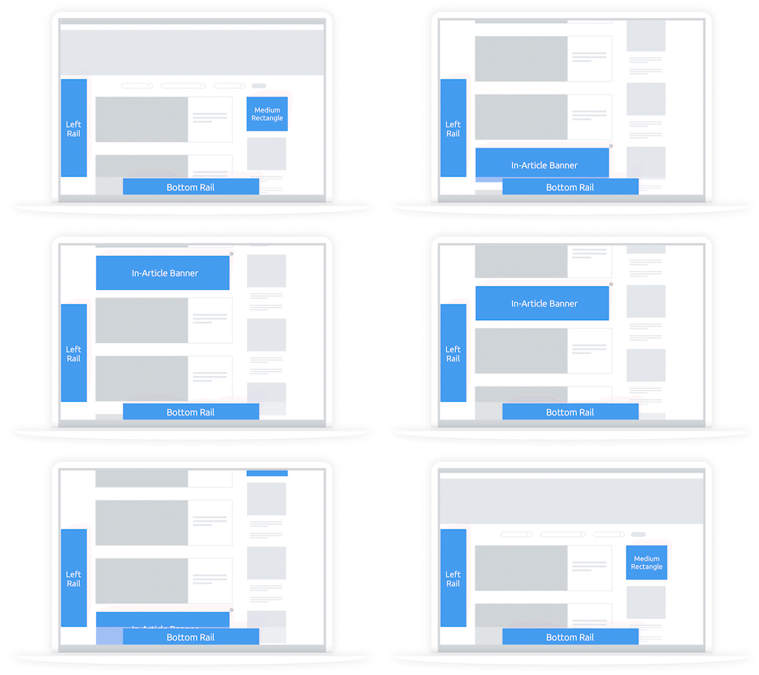
7. Try Out a Left Rail
If you're open to a more aggressive ad experience, a rail on the left-hand side of the screen can do wonders for viewability and CPMs.
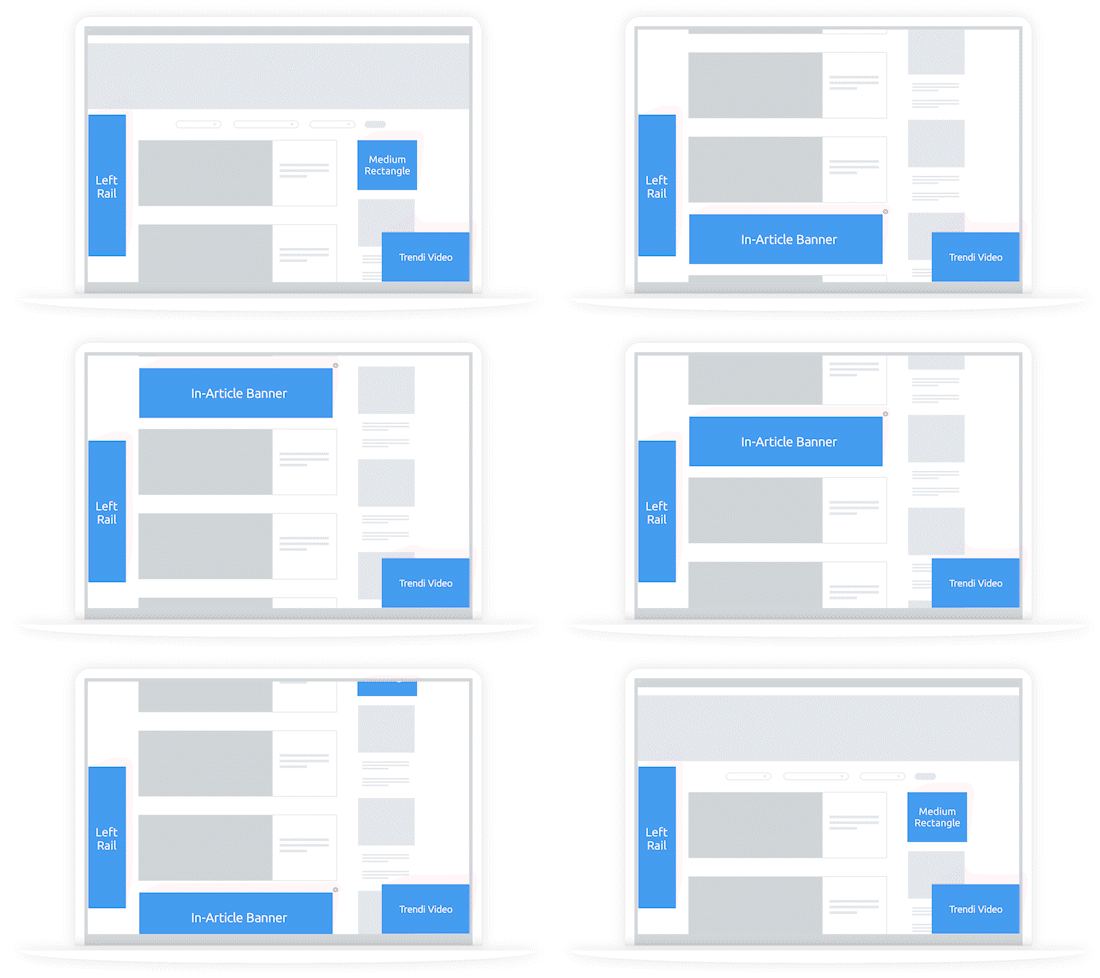
8. Consider Adding Video
Consider adding in the Trendi video unit to the mix if you are want to take advantage of video ads for a major CPM boost.
Explore Options Using the Arrows Below
.gif)
1. Start with a Bottom Rail
Start simple with our most commonly recommended ad unit, a bottom rail, great for viewability and revenue without disrupting experience.
.gif)
2. Add an In-Article
Add an in-article unit to help drive incremental revenue without overly changing the user experience.
.gif)
3. Try a Flex Leaderboard
Layer in our Flex Leaderboard unit. This unit will override the Bottom Rail when it serves to keep screen real estate from being overly dense. It is a great way to access direct demand and increase CPMs.
.gif)
4. Consider Trendi Video
Consider adding in the Trendi video unit to the mix if you are want to take advantage of video ads for a major CPM boost.
Additional
Ad Unit Ideas
WEB INTERSTITIAL
Looking to monetize transitions? You can use a web interstitial between screens, when a user selects an item from your listing page.
REWARDED VIDEO
Have premium content? You can use a rewarded video ad to offer access to gated content or to give users an optional ad-free experience on the rest of your site.
Amplify
Your Ad Revenue
Accelerate your business and uncomplicate your ad tech stack, because you deserve a partner and a platform that demands more for you.